Fine Performance Metrics and Spans#
While it’s trivial to measure the end-to-end runtime of a Dask workload, the next logical step - breaking down this time to understand if it could be faster - has historically been a much more arduous task that required a lot of intuition and legwork, for novice and expert users alike. We wanted to change that.
There are a few questions that someone who wants to optimize the performance of their Dask workflow typically asks:
How much time am I losing to GIL contention? Is it a problem?
How much time am I wasting in network transfer? Should I spend money increasing network throughput, or focus on optimizing data locality? What’s the potential benefit to end-to-end runtime?
I see a gray bar in the memory plot on the dashboard! This means that Dask is spilling data to disk as there isn’t enough RAM available. But how much of the end-to-end runtime is actually wasted on it? Should I spend money increasing available RAM, or developer time trying to reduce the memory footprint, or is it just not enough to bother?
The worker logs are saying that the event loop is getting blocked for many seconds at a time! Should I worry? Again, how much time, exactly, am I losing to this?
I just changed my algorithm, the version of Dask, or the version of other dependencies and now the end-to-end runtime is slower! Where am I spending more time than before?
I just doubled the size of my cluster but my workload is nowhere near twice as fast! Where did I accrue new inefficiency?
We recently introduced two complementary tools, Fine Performance Metrics and Spans, to answer these questions. They are available to all Dask users.
Fine Performance Metrics#
Since version 2023.7.0, Dask automatically collects metrics which break down the end-to-end runtime of a computation by task and, within each task, by a series of activities taken to complete it.
In order to observe these metrics, you can simply
run your workload end-to-end
open the Dask dashboard (default for a LocalCluster: http://localhost:8787)
select
More...->Fine Performance Metrics
Alternatively, if you’re using JupyterLab and
dask-labextension, you can drag the
Fine Performance Metrics widget onto your Jupyter dashboard.
The grand total of the time shown should roughly add up to the end-to-end runtime of your workload, multiplied by the number of CPU cores on the cluster.
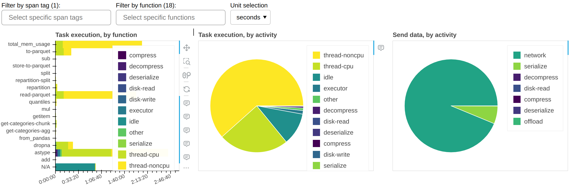
The central panel (Task execution, by activity) shows what activities the cluster spent its time on, cumulatively for all currently visible functions. The most important activities are:
- thread-cpu
CPU time spent by tasks while running on workers. This is typically “good” time; in other words it’s the same time you would have spent if you ran the workload serially on a single CPU - but parallelized over however how many CPUs are available on your cluster.
- thread-noncpu
Difference between wall clock time and CPU time spent by tasks while running on workers. This is typically I/O time, GPU time, CPU contention, or GIL contention. If you observe large amounts of this in your overall workload, you probably want to break it down by task and isolate those that are known to perform I/O or GPU activity.
If you observe large amounts of
thread-noncputime in what should be pure CPU tasks, the first thing you should investigate is GIL contention.- idle
Time during which a worker had a free thread, but nothing to run on it. This is typically caused by the workload not being able to fully utilize all threads on the cluster, network latency between scheduler and workers, or excessive CPU load on the scheduler. This measure does not include time spent while the whole cluster was completely idle.
- disk-read, disk-write, compress, decompress
Time spent spilling data to disk due to not having enough memory available.
- executor, offload, other
This is overhead from the Dask code and should be typically negligible. However, it can be inflated by GIL contention and by spill/unspill activity.
The left panel (Task execution, by function) shows the same information as the central one, but broken down by function.
The right panel (Send data, by activity) shows network transfer time. Note that most
of it should be pipelined with task execution, so it may not have an impact. You should
worry about this only if you have a very large idle time.
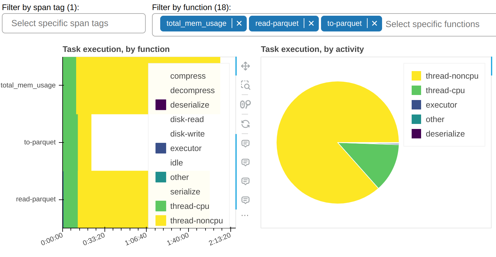
There is a filter that allows you to show only selected tasks. In this sample
workflow, you can observe that most of the thread-noncpu time is concentrated - as
expected - in tasks that are known to be I/O heavy. Here they are singled out:
And here’s all other functions that take a non-trivial amount of time:
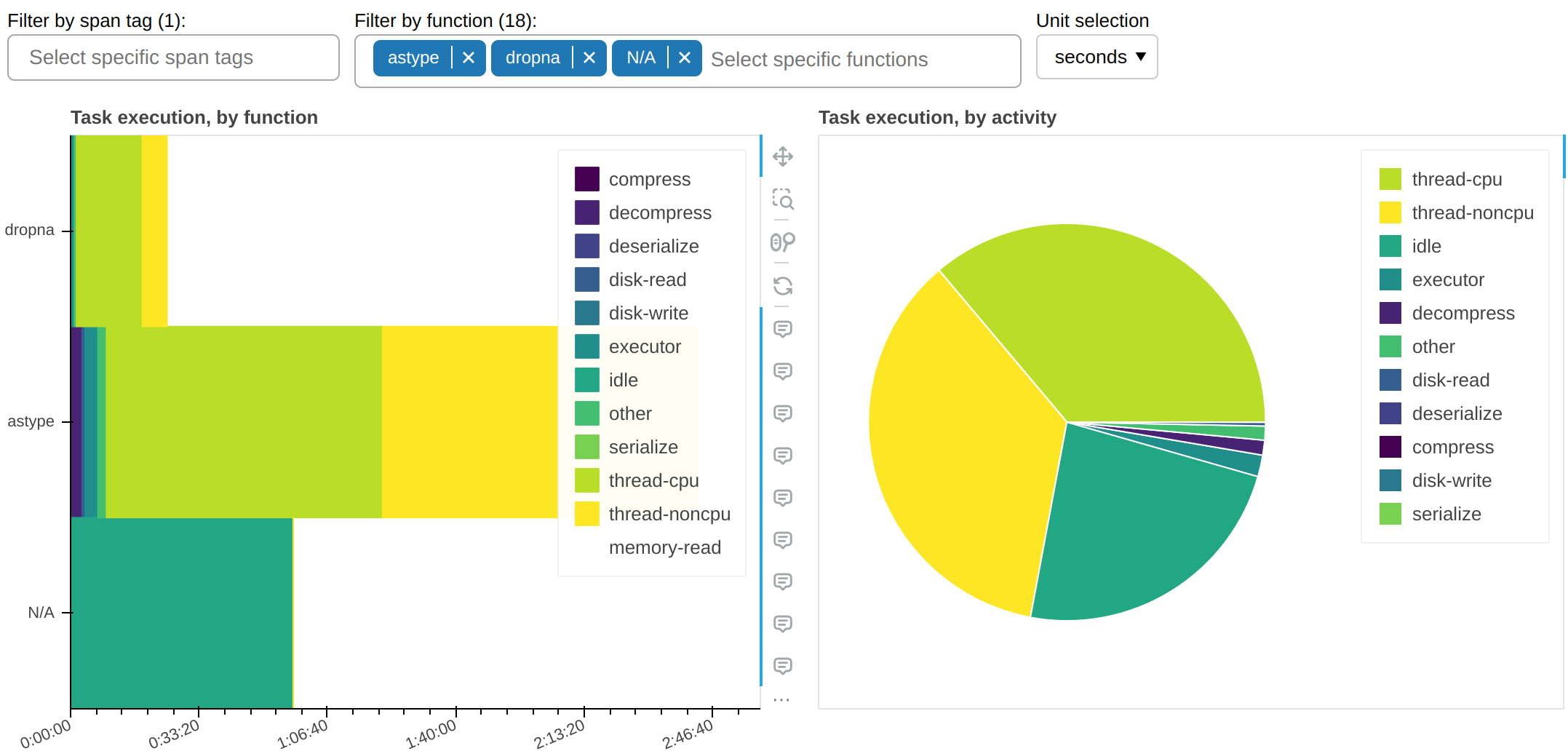
In this sample workflow, this plot tells us an important piece of information: why is
astype, which is a pure CPU function, spending so much time occupying workers’ threads
but without accruing any CPU time? The answer, almost certainly, is that it doesn’t
properly release the GIL.
Fine Performance Metrics collect more than wall clock timings. We can change the unit to bytes:
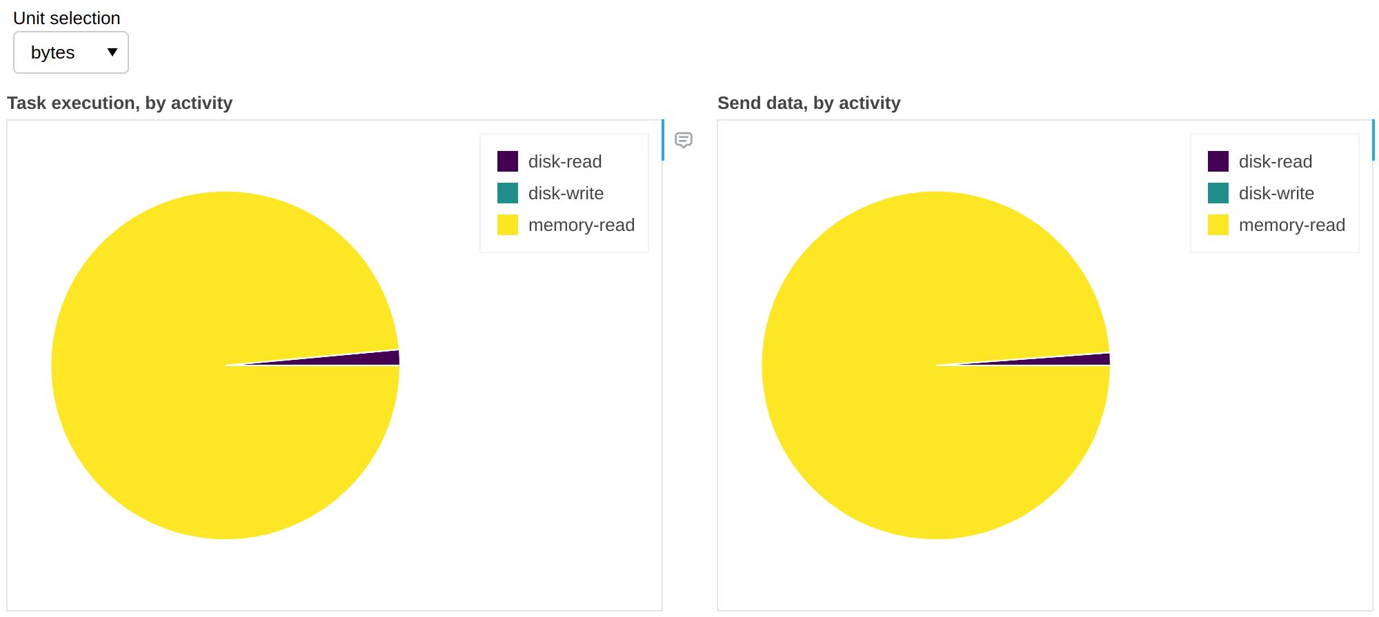
The above gives us insights on spill-to-disk activity. In this workflow, in 99% of the cases there was enough RAM to accommodate all the data and it was unnecessary to retrieve it from disk; in other words we have cache hits for 99% of the data, which means that we would not get any benefit if we increased RAM, but we would likely start seeing slowdowns if we reduced it.
This is corroborated by the time plots shown above, which show negligible time spent in
disk-read or disk-write.
Spans#
It can be non-trivial to correlate a task to an instruction on the client. The same function (e.g. a certain reduction) could also be applied in different sections of the code, to very different data. This problem becomes more severe as the complexity of the algorithm running on Dask increases.
Alternatively - or in addition - to the above, you may be in a multitenancy setup, where part of the load on the cluster was not caused by your client code, and you want to concentrate only on your own problem.
Spans let you break down fine performance metrics into macro-blocks (e.g. data load, preprocessing, etc.) by attaching meaningful tags to them.
To do so, you can use the span context manager inside the client code.
For example:
import dask.config
import dask.dataframe as dd
from distributed import Client, span

dask.config.set({"optimization.fuse.active": False})  # Don't lose task annotations
client = Client()

with span("Alice's workflow"):
    with span("data load"):
        df = dd.read_parquet(...)

    with span("ML preprocessing"):
        df = preprocess(df)

    with span("Model training"):
        model = train(df)

model = model.compute()
The example will create the following spans on the scheduler:
Alice's workflowAlice's workflow / data loadAlice's workflow / ML preprocessingAlice's workflow / Model training
Each of the spans will be mapped to the tasks matching the segment of the Dask graph that was defined inside its context manager. The parent span will be mapped to all tasks of its children.
Tags are arbitrary and nothing stops you from parameterizing them; for example
>>> with span(f"{user}'s workflow"):
...     ...
Which may give you Alice's workflow / data load, Bob's workflow / data load, etc.
This is useful for example if you want to observe either all the workload
submitted by Alice, while hiding Bob’s activity, or alternatively all the data loading
activity, regardless of who submitted it. You could use tags to store information on
what dataset you’re processing, etc.
Viewing the spans#
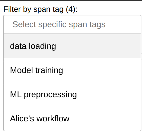
You can filter by span tags in the Fine Performance Metrics dashboard widget to filter your workload:
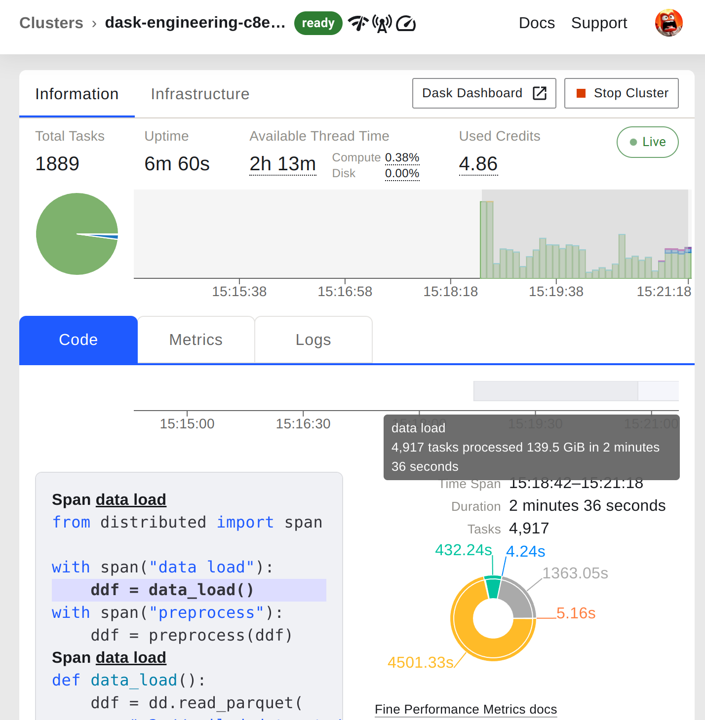
The Coiled dashboard#
Coiled users enjoy full integration of both of these new features into the Coiled Dashboard. In addition to Fine Performance Metrics, the Coiled Dashboard also uses Spans to highlight portions of the workload plot and to tag code snippets.
The functionality works out of the box; all you need to do is make sure you’re running dask 2023.7.0 or later:
You can get started with Coiled for free at coiled.io/start.
Conclusions#
These two new features should drastically improve users’ understanding of Dask performance. Are they useful to you? Are they easy to use? Is there a killer feature that you feel it’s missing? Let us know!